At the request of many in the marketing community, I decided to move my three-day dashboard course online. And you can be alerted when it’s available by signing up via the form at the bottom of this page (if you’re more the shut-up-and-take-my-money type).
UPDATE: It’s live. Check it out, yo!
Why This Course?
First off you might ask yourself, “Why would I want to learn from you?” That’s a totally fair question. As a marketer, I’m actually quite terrible at marketing myself. It feels painfully self-aggrandizing. But I will overcome my inhibitions for your sake. After all, this is ultimately about you, not me. That said, I’m not an unknown in the marketing community. I’ve been providing resources for marketers for years, like my Google Analytics campaign tagging guide, my Hundreds of Tools for Marketers resource, and my massive audit checklist doc. And my blog has also been recommended by Google itself as a useful resource for marketers and analysts. https://twitter.com/googleanalytics/status/439080636259647488 I also speak quite frequently at conferences across the country, such as MozCon, SMX, SearchLove, Authority Intensive, MicroConf, etc. But enough about me. Let’s talk about you and what this can do for you. Analytics is a super-hot skill that employers are seeking out. They’re desperate for help in analyzing and deciphering their sites’ traffic trends. If you have the skills to not only understand their analytics but also be able to leverage the Google Analytics API and create dynamic, compelling (and quite sexy) dashboards from them, you will be infinitely more marketable. That’s why.
What You Will Learn
Here is a breakdown of what you will learn from this course:
Day 1
Day 1 is broken into two sections:
Overview Of Google Analytics
You will not learn everything there is to know about Google Analytics in this course. That, in and of itself, couldn’t be taught in three days. However, by the end of this section you will be able to:
- Identify KPIs that are common to most reporting dashboards marketers create
- Leverage custom reports to sketch out your data pulls
- Identify signs of sampling and the main causes of sampling (with ninja tricks on how to minimize it using the API on the third day)
- Learn the biggest reporting faux pas, such as mixing the wrong dimensions and metrics (which Google Analytics will sometimes let you do without warning!)
How To Use The Google Analytics API
If you are creating your monthly reports for your boss or clients by going into the Google Analytics interface, running the reports you need, exporting them, assembling them in Excel, and then manually formatting them each month, you are literally wasting hundreds of hours each month (thousands if you’re an agency). The Google Analytics API will be your best friend by the end of the course. I will be teaching you how to pull just the data you need right into Excel with a free add-in. I will also warn you of the pitfalls with this data and how to circumnavigate them. I will also give you the exact Excel formulas you will need to clean up some of the data that comes through mangled and unusable. By the end of the day you will have pulled a number of reports from your own Google Analytics profile. But more importantly, you will have the ability to reverse engineer all of your favorite reports in Google Analytics so that you can apply everything you learn in the course to your own reporting dashboards.
Day 2
We will take a series of API exports and develop them into rich visualizations in Excel. By the end of the day you will learn how to:
- Tightly organize the data in your dashboard
- Create a blueprint for others to be able to easily find the data that feeds each of your visualizations
- Interlink elements of your dashboard for ease of navigation
- Choose which charts should be used for various types of data sets
- Spice up tabular data (data in tables) to make it easier to interpret
- Create visualizations that maintain best practices of data design
- Align your dashboard design with your branding (including how to easily replicate these formats in all of your Excel docs across your entire company)
- Create charts with varying depths of detail without overwhelming your dashboard recipients
- Display month-over-month and year-over-year data in charts and tables
- Organize complex data sets with pivot tables before charting them
Day 3
On Day 3 we get into advanced data culling, cleanup, and charting techniques. I will also do a demonstration of Analytics Canvas, what I believe to be the best paid Google Analytics API tool on the market. (And I’ve tried all of them.) By the end of the day you will learn how to:
- Clean up messy data from the API (mistagged campaigns, duplication due to inconsistent capitalization, misspellings, etc.)
- Create interactive charts, such as scrolling charts for data that span years, radio buttons and checkboxes for data that can be turned off and on, and drop boxes that can control multiple charts at once (even an entire dashboard), etc.
- Consolidate multiple data sets into one space on a dashboard using drop-downs
- Create a branded navigation bar to split larger dashboards into multiple sheets without losing dashboard continuity
- Avoid the need to manually select data ranges that vary in size from month to month using a combination of named ranges and dynamic formulas in Excel
- Minimize (and potentially eradicate) sampling for enterprise sites
- Dynamically pull data from Google Spreadsheets and databases into your reporting dashboard
- Marry data from Google Analytics to data in a Google Spreadsheet and/or database
Video Walkthrough Of Template
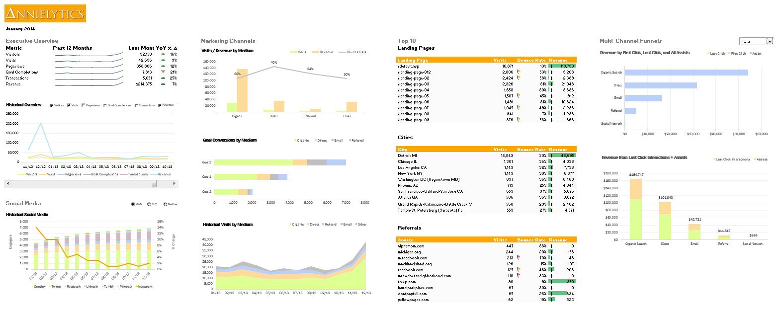
Below is a video walkthrough of the template we’ll be building of the dashboard. It’s a bit busier than I would normally design, but I wanted to be able to demonstrate as many hot data visualization techniques as possible.
Pricing
The cost of this course is $1295 and will include access to the videos for one year and an electronic version of the workbook.
Be The First To Know
I hope to have the course available within the next month. If you’d like to be notified when the course is available, sign up here. Your email will not be used for any other campaigns.
UPDATE: No need to fill out a form. The course is live, so check it out!
Any plans offer a version of this course discussing Tableau (rather than Analytics Canvas)?
Not until they get up to date with Google Analytics. To date, they still don’t include the multi-channel funnels API (which is unconscionable) or the Device Category dimension, which is critical to segmenting traffic and conversion data.
Looks to be an awesome course. I’ve been waiting for you to do this. Any catering to the Mac side of things is much appreciated.
I give instructions for both PC and Mac all throughout. I had all three versions on my laptop. I never leave my Mac comrades behind. 🙂